
Opening the Dashboard for the first time means meeting a screen full of cards, and it is normal not to know where to look first. The board is simpler than it appears: every card tells its story in the same shape, so learn to read one and you can read the whole page.
⚡ Quick Path:
Dashboard→ pick a month in the field at the top right →Search→ scroll down and read one group at a time
Requirements before you start
- Access to the
Dashboardmenu — it is the first item in the left menu bar. If you cannot see it, ask an administrator on your team to grant access first. - Knowing which brand you are looking at — under your name at the top left it reads
Working onfollowed by a brand name. Every figure on the page belongs to that one brand. - Nothing else to prepare — this is a read-only page. There is nothing here to press by mistake and nothing to lose, so explore freely.
The layout of the Dashboard
The cards are not scattered at random. They are grouped, and every group carries its own time label in the right-hand column. There are only 2 labels you will meet: Today and a month name such as August, 2026.
Today means the figures in that group are a snapshot of the day you are viewing. A month name means the figures cover the whole of the month you have selected. The 2 alternate down the length of the page.
Within each group, the wide chart sits on the left and the summary stat cards stack on the right. The chart shows the trend, the cards show the latest figure, and both are describing the same thing.
At the top right of the page there is a month field in MM-YYYY format, such as 08-2026, with a Search button beside it.
📌 Good to know: Changing the month does not change any figures until you press Search. It is the single most commonly missed step on this page.
The 3 lines on a stat card
Every stat card on the board looks the same, and each has 3 lines. Read one properly and the rest of the page follows.
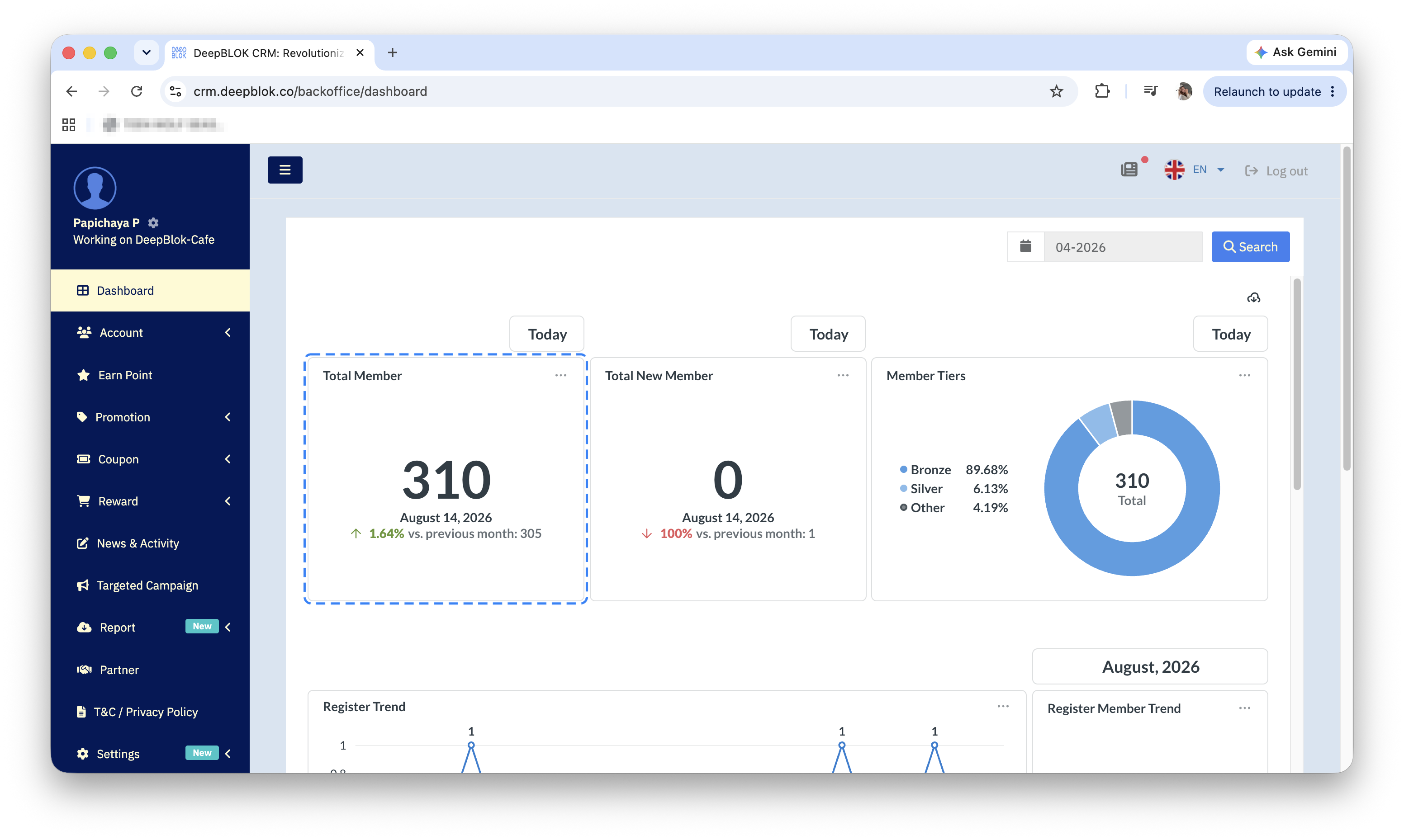
That bottom line comes in 3 forms you will meet often.
A green upward arrow with a percentage means the figure rose against the previous period, and the number at the end of the line is the value it was compared with. In the example above, last month had 299 members and this month has 308 — 9 more, which is the 3.01%.
No change vs. previous month means the figure is identical. The system spells it out in words rather than showing 0%.
∞% means the previous period was zero. If last month had no new members and this month has one, there is no percentage to calculate from zero, so the system prints this symbol instead. It is not an error.
⚠️ Note on the comparison baseline: the bottom line does not always compare against last month. Some cards say vs. previous month, meaning month against month. But the daily snapshot cards print an actual date, such as vs. July 3, 2026, meaning the same day of the previous month. Read that line to the end before drawing a conclusion, so you do not compare 2 figures on different bases.
The card groups and the question each one answers
1. How many members there are, and how fast that is growing Total Member is the total membership as of the day you are viewing, and Total New Member is the count of members who joined that day. Below them, Register Trend is a daily line chart for the selected month with a value printed above every point. Beside it is Register Member Trend, which is a stat card rather than a chart. Below that, Registration by Branch is a horizontal bar chart showing which branches new members came from.
2. Whether members are still coming back Active Member Trend is a daily line chart, paired with the Active Member card that sums it up in one figure. Below them is Churn Customer, a multi-line chart that groups lapsed customers into 5 bands: 30 - 60 Days, 61 - 90 Days, 91 - 180 Days, 181 - 360 Days and >360 Days. Beside the chart is a two-column grid of 6 cards. The first, Avg (days), is the average number of days customers have been away; the other 5 give the head count in each band.
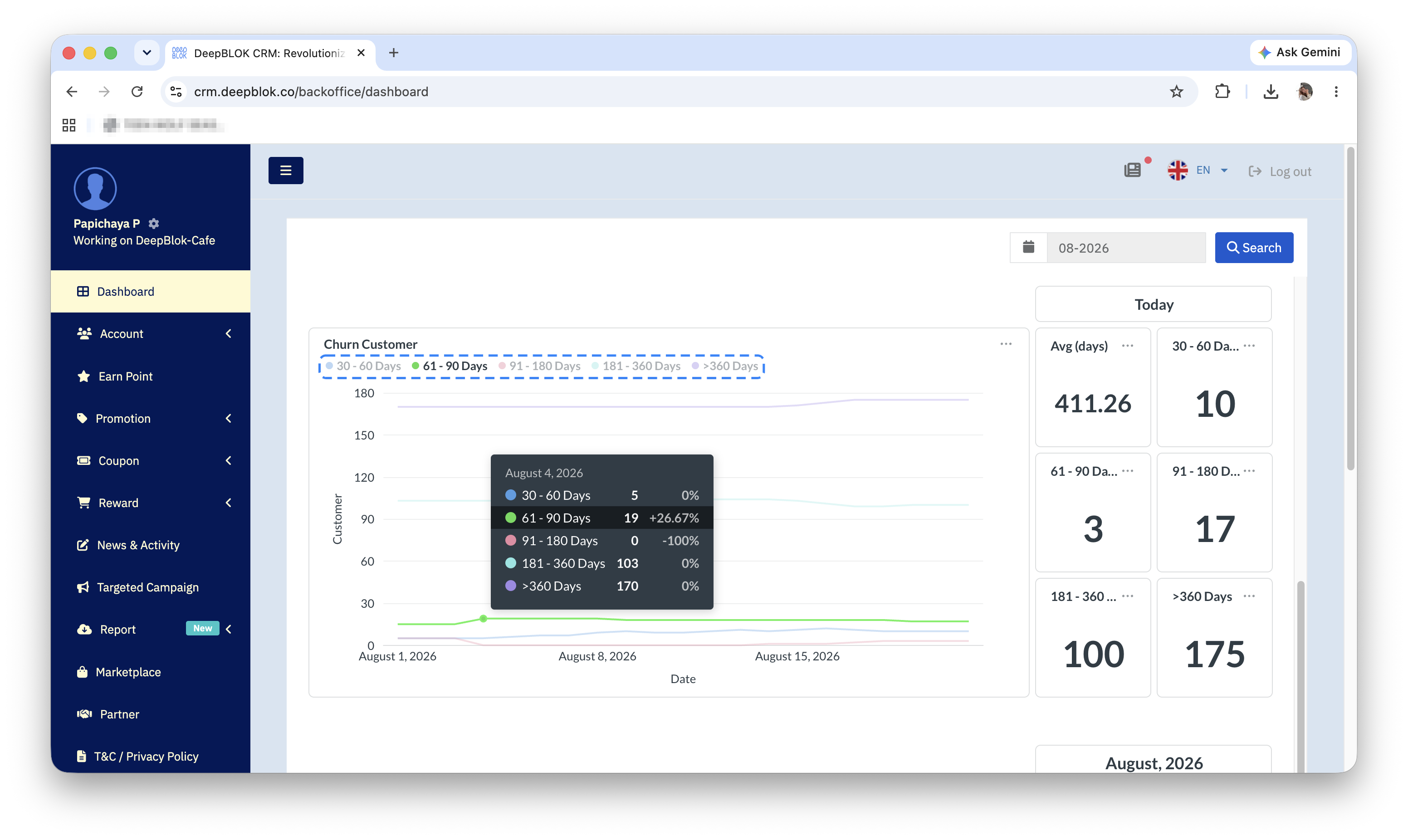
3. How members are spread across tiers Member Tiers is a single donut chart. The centre of the donut gives the total member count with the word Total, while the legend beside it gives each tier's share as a percentage, such as Bronze 90.26%. Tiers with only a few members are rolled together into one slice labelled Other.
4. How many points went out, came back, and are still outstanding This group stacks 2 charts: Point Movement (Point Earn) for points issued and Point Movement (Point Burn) for points customers have spent. Beside them are 3 cards — Point Earns, Point Burns and Float Point. That last one is points issued but not yet spent, and it is the figure worth watching, because it is a liability still sitting on your books. Note that the chart and card names differ slightly: the charts read Point Movement (Point Earn) while the cards read Point Earns. Both refer to the same thing.
5. How sales are doing 2 charts here: Sale Trend (Volume) for value and Sale Trend (Transaction) for count. Beside them are 5 cards — Sale Volume (THB), Sale Transactions, Unique Customer, Average Ticket Size (THB) and Average Visit. The last 2 answer how much a single customer spends per visit, and how often they come back.
6. Who and what is performing best The foot of the board holds 4 ranking cards in 2 rows of two: Top Customers, Top Branches (Sale), Top Items and Top Rewards Redemption. Below them sits Purchase Frequency, a horizontal bar chart that groups customers by how many times they bought, in 4 bands: 1-2, 3-4, 5-6 and > 6. The 4 ranking cards have an article of their own.
✅ Check your understanding: try answering these 2 without scrolling back up. When a card sits under a Today label, what period do its figures cover? And if the bottom line reads ∞%, what does that tell you? If both come easily, you can read this board.