

Dashboard is the first page the system opens after you log in, and it holds your whole month in one screen — from member counts and tier mix through to points, sales, and your top customers, branches, items and rewards. Working through the whole page takes about 3 minutes, and nothing you do here changes any data: it is a view-only page.
⚡ Quick Path:
Dashboard→ pick a month at the top right →Search→ scroll down for the monthly cards
Requirements before you start
- A Backoffice account you can already log in to (if you can't get in, tell your system administrator or check your access rights)
- Your Role needs access to the
Dashboardmenu — if you can't get in, tell your system administrator, as your account may not have access to this menu yet - Check the brand name at the top left (
Working on …) matches the brand you want to look at — every number on the Dashboard belongs to that brand
The Dashboard has 2 kinds of section
The single thing that makes this page easy to read is knowing that the numbers on it come in 2 kinds, they answer 2 different questions, and you can tell them apart from the label box in the right-hand column, which alternates all the way down the page.
What that means: if you want to know "how many members do we have right now", read the top row under Today. If you want to know "what did we sell last month, and who bought the most", pick the month first, then scroll down to the sections under a month label.
Every section is built the same way — a wide chart on the left, and summary stat cards stacked on the right. Once you spot that pattern, the whole page reads much faster.

How to use the Dashboard
Step 1: Open the Dashboard menu
Click Dashboard, the first item in the left sidebar. The menu you're currently in is highlighted with a pale-yellow background so it's easy to spot.
If you have just logged in, the system already brought you here — there's nothing to click.
Step 2: Pick the month you want, then press Search
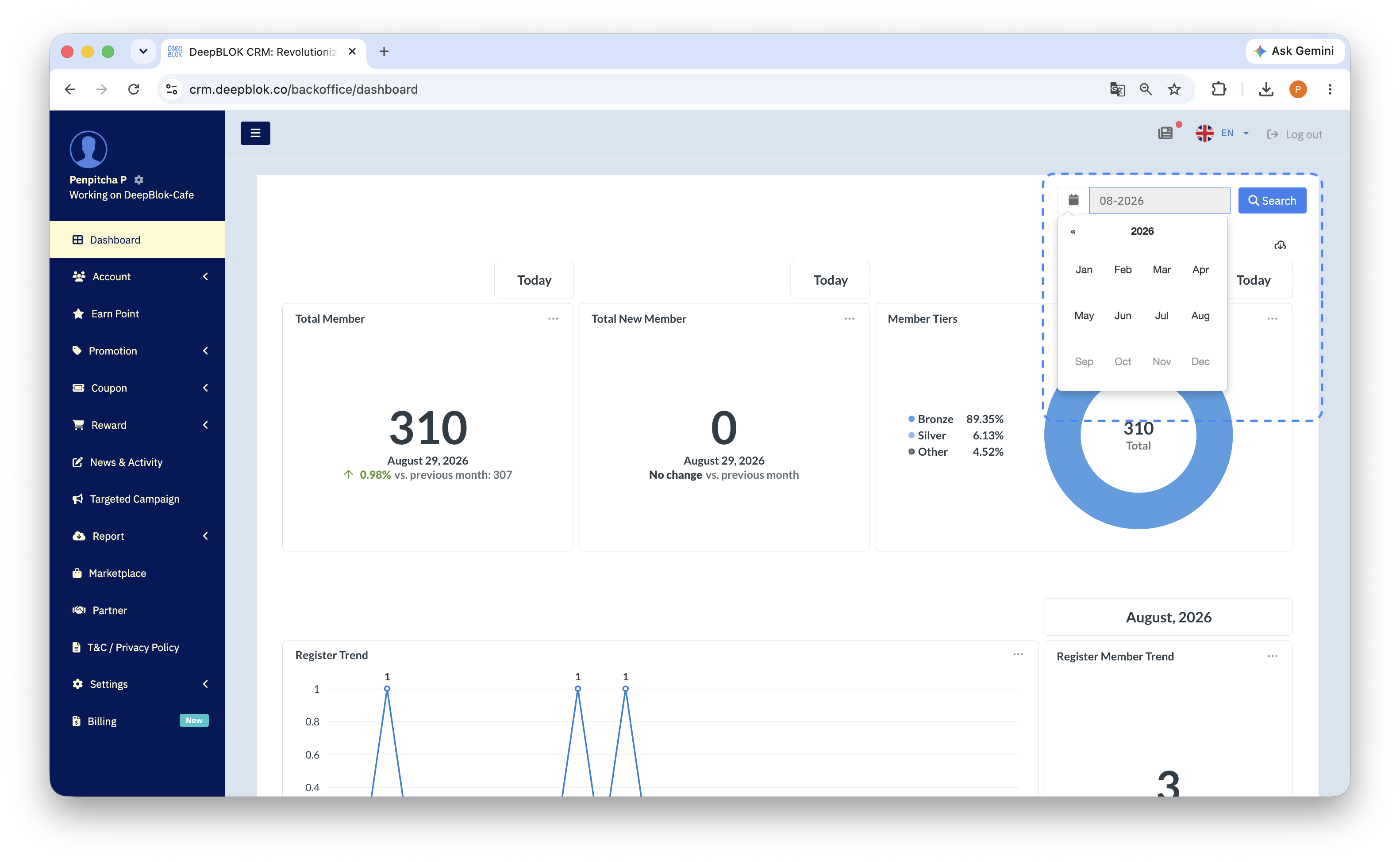
At the top right of the working area there's a month field, shown in month-year format such as 08-2026, with a blue Search button beside it.
- Click the month field and choose the month and year you want
- Click the blue
Searchbutton
📌 Good to know: the numbers in the monthly sections don't change until you press
Search. If you changed the month and the charts still show the old data, go back and press that button.
Step 3: Read the 3 cards at the top
The first 3 cards are the overview of your member base. Read them left to right.
1. Total Member The large figure is how many members you have. Below it is the date the figure is from, then a comparison line giving both the percentage change and the figure it was compared against — for example ↑ 3.01% vs. previous month: 299. The arrow and percentage render green when the number is up.
2. Total New Member How many new members signed up, with a comparison line in the same format. If the figure matches the comparison exactly, the line reads No change vs. previous month rather than showing 0%.
3. Member Tiers A donut chart showing how your members are spread across tiers. The legend on the left runs through the tiers with their percentages, for example Bronze 90.26% and Silver 5.52%. Tiers holding a small share are grouped together as Other. The centre of the donut shows your total member count, labelled Total.