

Customers who drift away do not all drift equally: some have been gone a month, others over a year. The Churn Customer card on the Dashboard separates them into 5 bands. This article covers the chart, the summary cards beside it, and the daily figures hidden inside the chart.
⚡ Quick Path:
Dashboard→ scroll to theChurn Customercard → click a point on the chart to read that day
Requirements before you start
- Access to the Dashboard — it is the first page after signing in. If it will not open, ask an administrator on your team to grant access.
- The month you want — the month picker sits at the top right of the page, and this card's chart is the daily data for whichever month is selected.
- The question you are answering — whether churn is rising or falling, or which band is biggest. Those 2 questions are answered by different parts of the card.
The 5 bands of lapsed customers
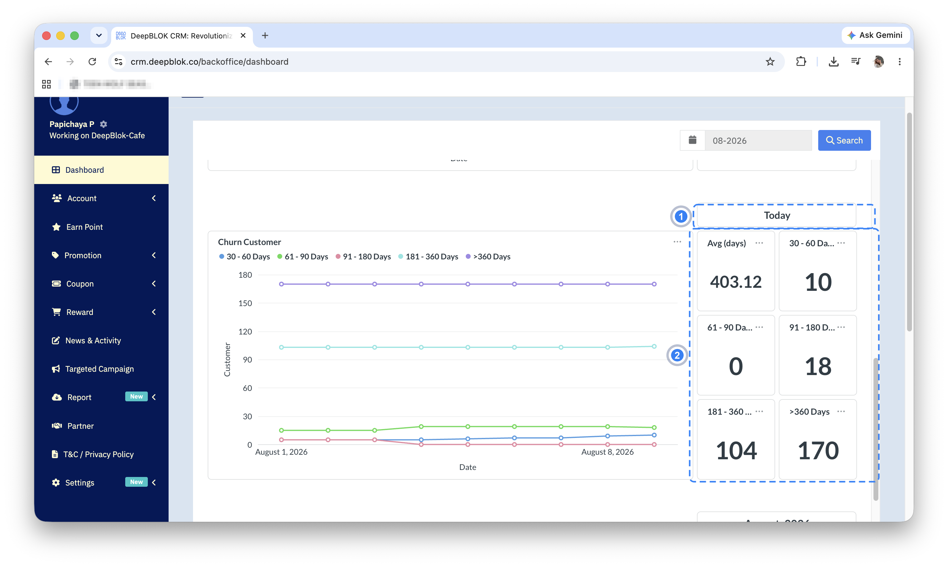
Above the chart is a legend of 5 colours, each a band of how long a customer has been away, ordered shortest to longest.
Read the bands against your own trading rhythm first, because how often customers come back differs from business to business. A coffee shop whose customers drop in weekly and a furniture store whose customers buy once a year mean different things by a lapsed customer. The 30-60 day band can be an early warning for one and still be normal for the other.
1. 30 - 60 Days Recently lapsed, and the easiest group to win back while the brand is still fresh in mind.
2. 61 - 90 Days Away for a couple of months. An offer still has a reasonable chance here.
3. 91 - 180 Days Away for more than a quarter. Winning them back needs a stronger reason.
4. 181 - 360 Days Away for more than half a year, which usually calls for a campaign aimed at them specifically.
5. >360 Days Gone for over a year — mostly the group to accept as lapsed for good.
The chart below plots one line per band. The vertical axis, Customer, is the number of customers; the horizontal axis, Date, is the days of the selected month.
The 6 summary cards beside the chart
To the right of the chart sit 6 figure cards in 2 columns. The first is Avg (days), the average number of days customers have been away. The other 5 are the number of customers in each band, using the same names as the legend above the chart.
📌 Good to know: the label above this set reads Today, and scrolling down reveals a second set labelled with a month, such as August, 2026. The 2 sets cover different periods: the first is today's figure, the second belongs to the month selected in the search box. Their numbers not matching is normal. When quoting a figure to a colleague, say which set it came from.
The average versus the individual bands
Avg (days) is the easiest figure on this card to misread, because it averages the whole pool and is therefore pulled by the group that has been away longest.
⚠️ Note on an average higher than every band: in the example above the average is 403 days — beyond the upper edge of even the last band. That is not a system error. The >360 Days group holds 170 customers, more than half of the 301 counted altogether, so it drags the average upwards. When deciding on a campaign, work from the number of customers in each band rather than the average, because the average says nothing about how many are still worth trying to win back.
Reading a single day from the chart
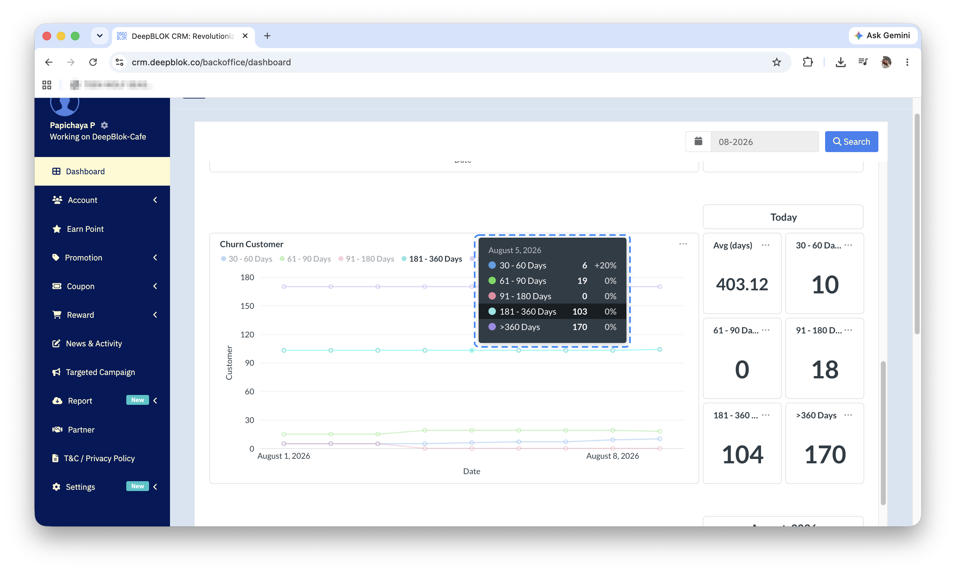
The chart carries no figures on the lines themselves, but clicking any point opens a box giving that point's date and then every band's figure on its own coloured line.
The box also shows a percentage beside each figure. In the capture of 4 August 2026, the 61 - 90 Days band reads 19 with +26.67%, which matches a rise from 15 at the previous point, while 91 - 180 Days reads 0 with -100%, having fallen to nothing. The percentage is therefore the change from the previous point on the chart, not a share of the whole pool.
✅ Check your understanding: if the Today card for 30 - 60 Days reads 9 while the box for 4 August says the same band holds 5, which figure is wrong? Neither: the card is today's number and the box is 4 August's. If that is your answer, you are reading this card the right way.
Common Problems
Frequently Asked Questions
Q: What are these figures counted from?
A: They are the number of customers in each band of time away, as labelled on each band.
Q: What does the percentage in the box compare against?
A: The previous point on the chart. In the capture, 61 - 90 Days rises from 15 to 19 and shows +26.67%, which is exactly that change.
Q: Where can I see who is in each band?
A: This card gives counts only, never names. To run a campaign at lapsed customers, build a customer group from the Segmentation menu instead — though a condition that filters on days since last purchase has not been confirmed as available, so do not plan around it.