

The Insight tab on a customer's profile summarises how that one customer shops: their lifetime spend, how often they come back, what they buy most, and which branches they visit. Unlike the earlier articles in this pillar, which answer a customer's own question about one transaction, this page answers your team's questions — such as what offer this customer should get next. Reading it end to end takes about 3 minutes, and it works for any login that can open a member profile.
⚡ Quick Path:
Account→Search / Detail→ search for the customer →person icon →
Insighttab → set the date range →Search
📌 Read this before you start — every figure on this page depends on the date range. The range sits at the very top of the page, and everything below it is calculated from that range alone. Reading the figures without checking the range first is the easiest way to draw the wrong conclusion — a low spend often means the range simply does not cover the period the customer was buying in.
Requirements before you start
- The right customer's profile already open — the name on the card at the top left must be the customer you mean to look at. Searching for them and opening the profile are covered in the article on member search.
- The period you want to look at — the last 3 months, 6 months or a full year is up to you, but choose deliberately, because the range governs every figure on the page.
- The question you want answered — the page holds several sections, so knowing whether you are after frequency, spend or favourite products lets you go straight there.
The date range that governs every figure
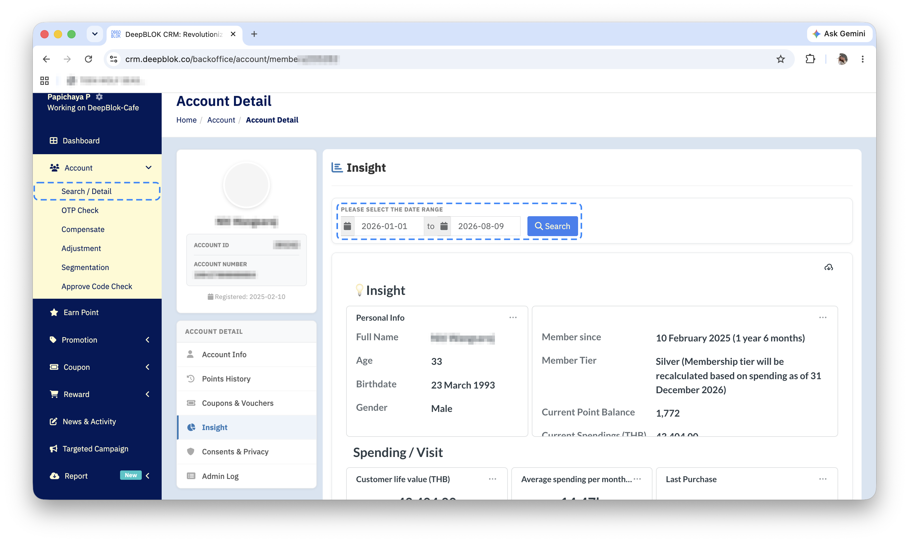
At the very top of the Insight tab is a box headed PLEASE SELECT THE DATE RANGE. Inside it are two date fields separated by the word to, followed by a blue Search button.
Set the start date in the left field and the end date in the right, then press Search — every figure on the page recalculates for the range you chose.
Each group of data also carries its own date-range chip in its top-right corner, reading something like January 1, 2026 - June 4, 2026. That chip confirms which range the group in front of you is using.
⚠️ One thing to watch: an empty card does not mean the customer has no history. Where the chosen range holds no purchases, the figure cards show a faint arrow illustration instead of a number. When you see that, we recommend widening the range and pressing Search again before concluding the customer has never bought anything.
The Insight section: the customer in brief
Below the date range is a card headed Insight, split into 2 panels side by side.
The left panel, Personal Info, holds several lines you can scroll: Full Name, Age, Birthdate and Gender.
The right panel carries no title but holds the membership details, also in several lines you can scroll: Member since, the join date with the number of days as a member in brackets · Member Tier, the current tier together with a note saying the tier will be recalculated from spending · Current Point Balance, the point balance · Current Spendings (THB), total spend in baht · and Register Branch Name, the branch they signed up at, which reads Empty when there is no value.
📌 Good to know: 2 of the lines in the right panel repeat what the Account Info tab already shows — the tier and the point balance. What this page adds is Member since with the day count worked out for you, so you can say how long the customer has been with the brand without doing the arithmetic.
The Spending / Visit section: 5 figures and the comparison
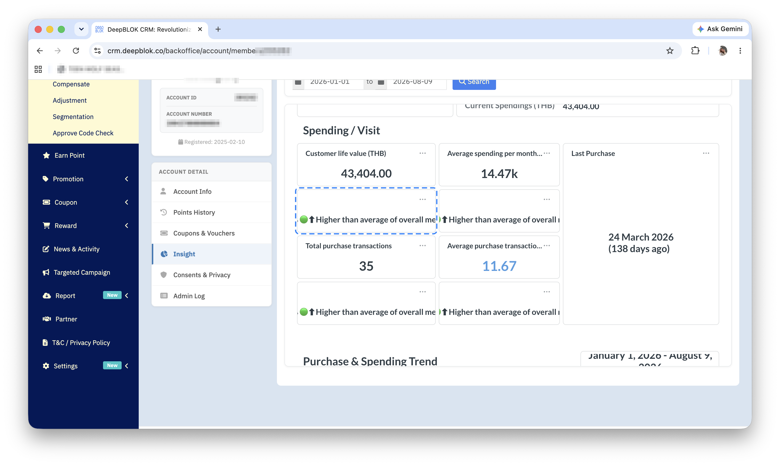
This section is a grid of figure cards, each answering a different question.
1. Customer life value (THB) The customer's total spend. This is the card for "what is this customer worth to us".
2. Average spending per month (THB) Their average monthly spend. This compares better between customers than lifetime value, because it does not favour whoever has been a member longest.
3. Last Purchase The date they last bought, shown large with the number of days since in brackets — (81 days ago), for example. This is the fastest read on whether the customer is still coming back or has drifted away.
4. Total purchase transactions How many purchases they made inside the chosen range.
5. Average purchase transactions per month Their average number of purchases per month, which is the read on how often they return.
Under the first 4 figure cards sits a smaller card holding a percentage with an arrow and a coloured dot — 328% 🟢↑ Higher than average of overall member, or -22% 🔴↓ Lower than average of overall member. That card compares this customer against the average of all members.
⚠️ One thing to watch: the percentage compares the customer against the average of all members, not against their own past. So 328% means well above the average of all members; it does not mean their spending grew by 328%. The green or red only says above or below average — it is not a verdict on the customer. Someone who spends heavily but rarely will show 2 green cards and 2 red ones at once, and that is perfectly normal.
The Purchase & Spending Trend section: the chart and its figures
This section shows the trend across the chosen range: a chart on the left and 3 figure cards on the right.
The chart is titled Purchase & Spending Trend and carries its legend above it — Purchase as a blue line and Spending as an orange one. The left axis is Purchase, the number of purchases; the right axis is Spending, the amount spent; and the horizontal axis is Date.
The 3 cards on the right are Spending (THB), the total spend inside the range · Purchase transactions, the number of purchases inside the range · and Average Ticket Size (THB), the average value of one purchase, worked out as total spend divided by the number of purchases.
📌 Good to know: Average Ticket Size is the figure that most directly informs an offer, because it says what the customer typically spends per visit. If you are setting a spend-and-get promotion threshold, this is the number to start from.